Branding
Pepsi – Our Favorite 2023 Rebrand
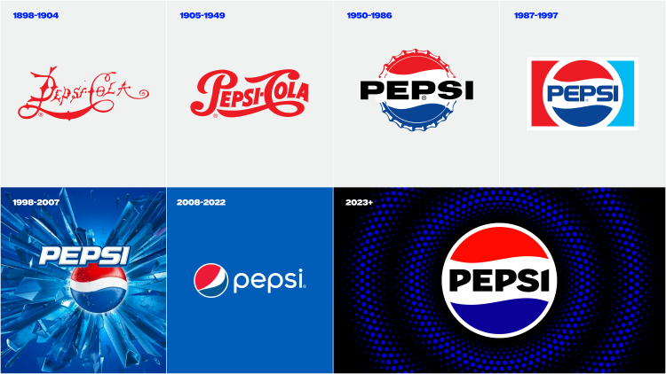
Pepsi, a name synonymous with soda pop worldwide, has a long history of evolving its visual identity. From the original script logo in 1898 to the iconic red, white, and blue circle in the 1940s, each change has been a reflection of the cultural zeitgeist and an indicator of the company’s forward-thinking approach. Throughout the past century and a quarter, the Pepsi logo has seen more than a dozen iterations, each rebrand uniquely aligning with the era and mood of the times while retaining the spirit of the original.
The New Logo
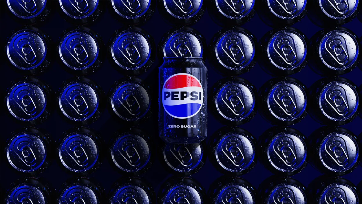
This year, as Pepsi celebrates its 125th anniversary, the company has unveiled another rebranding effort, an emblem of their continuous innovation. This latest design features a striking typeface, a pulsating signature motif, and a revitalized color palette. The new design notably introduces the color black, a nod towards the growing popularity and importance of Pepsi Zero Sugar in their beverage lineup.
The redesign marries contemporary aesthetics with elements borrowed from Pepsi’s rich heritage, culminating in a visual identity that is both fresh and familiar. The logo and wordmark are now seamlessly united, fitting effortlessly into a variety of settings and enhancing the unmistakable Pepsi branding. Also introduced is a visually distinctive can silhouette that puts the iconic Pepsi can front and center, celebrating the brand’s accessibility. The new design even brings life to the ‘pop and fizz’ of Pepsi-Cola, invoking the brand’s legacy in music and culture through a signature pulse.
Our Take
In our opinion, Pepsi’s 2023 rebranding is a masterstroke. It strikes the perfect balance between embracing the old and welcoming the new. The introduction of black to the color palette lends a modern, edgy vibe while the revamped typeface speaks to the brand’s unapologetic confidence.
What particularly stands out is the flexibility of the new design. With more room for movement and animation, the design translates seamlessly from physical to digital, embodying Pepsi’s commitment to adaptability in an increasingly digital world. Moreover, the clever nod towards Pepsi Zero Sugar with the color black demonstrates a brand that is conscious of its product evolution and changing consumer preferences.
Moving Forward
As Pepsi enters its next era with a future-facing gaze, we’re excited to see this new visual identity in action. The brand plans to roll out the new look this fall in North America, just in time to commemorate its 125th anniversary. The rest of the world will witness the transformation in 2024.
This rebrand is not just a makeover; it’s an expression of Pepsi’s continued evolution while staying true to its roots. As we move forward, we expect the new logo and visual identity to reinforce Pepsi’s standing as a brand that is always in step with the times, unapologetically enjoyable, and constantly pushing the boundaries. Here’s to the future, filled with a revitalized Pepsi brand we’ve all grown to love.